Occasionally when I click the ‘start prompting’ button, this message briefly appears at the bottom of the window. Does this indicate a problem?
It’s not necessarily a bad thing. “Animation Complete” indicates the prompter has finished scrolling to either the start or the end of the document. This could sometimes be triggered accidentally if the prompter’s placement is changed to the start or end as a result of the editor toolbar’s height changing.
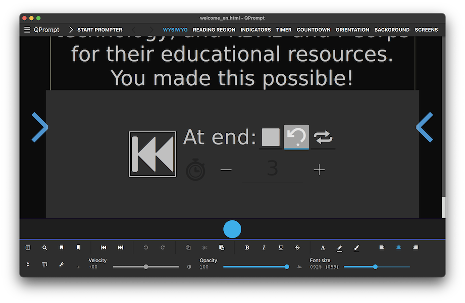
I think there’s no need to notify the user that the start has been reached, because it’s no longer necessary to “rewind” manually, as QPrompt offers various tools to reach the start more quickly. The newest one being a big rewind button at the end of the scroll. (See picture)
Since the “end reached” controls make it evident that you’re at the end, I think I should get rid of the “Animation Complete” notification altogether.
What do you think?
The message does not affect me either way as long as it does not appear while scrolling lol.
As for the ‘rewind’ option at the end, not really necessary for my work flow, however the other software I use has these buttons that jump to the head and the end of a document, taking up little UI space… is this an option?
It could be done.
But first: When providing images of other software, please trim them to show only the issue or solution that you’re trying to bring forth. I don’t want the project to be accused of plagiarism, patent, or copyright infringement because of users comparing other software to the project.
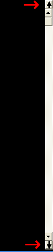
Back to topic: Extra arrows at opposite sides have fallen out of favor due to the time that it takes to point and click them. A more productive approach is placing both extra arrows bellow the scrollbar, similar to how it’s done in various popular word processors, such as MS Word, WordPerfect, and WPS Office in this picture:

An advantage of following that approach is that the same buttons could be repurposed to move between text found in a search or markers if so desired. Nevertheless, having the buttons at the bottom would shrink and offset the side bar up, meaning it could fail to act as an accurate progress bar.
Hiding these buttons while prompting would liberate the space to be used by the scroll bar at the expense of loosing the button while prompting. Another option would be to leave the buttons at the button and make sure they have a border or background color that sets them apart from the rest of the scroll bar.
I couldn’t find anything relating to scroll bars on KDE’s Human Interface Guidelines. A change like this should be consulted with KDE’s Consistency Group to make sure that we don’t re-invent the wheel or divert too much from the design in other KDE software. We could also implement the feature first and change it later because, at present, QPrompt is not a KDE app. Nonetheless I’d like to leave that door open, hence why I follow the HIG for most things.
Also at the time of writing, I’m not clear on how to implement this feature without potentially crashing QPrompt. QML’s ScrollBar placement is very tricky and can crash the program if used incorrectly. This API also provides no means to add buttons. Though, I think, it shouldn’t be too difficult.
My apologies, I will follow the image guidelines in the future. Perhaps your hotkeys of Ctrl>Home, Ctrl>End are sufficient.
No worries. I thank you for all of your support! QPrompt’s guidelines are scattered all over the place and documentation is nearly non-existent. Soon we’ll have a wiki so that both the community and I can write and improve documentation.
I love the work that was done on Manjaro Linux’s new website, so our wiki will use the exact same wiki engine and theme as them. Link for reference: Manjaro